The latest Qorus release is here, and with it come a bunch of usability improvements designed to make it easier to work with your connected content and boost your productivity.
Here are the highlights:
- There's a new 'Home' screen, and that's where you'll find your favorites
- The 'Manage' screen has been retired
- There's a new option in the Selectable Preview: 'Alternative Preview'
The new 'Home' screen
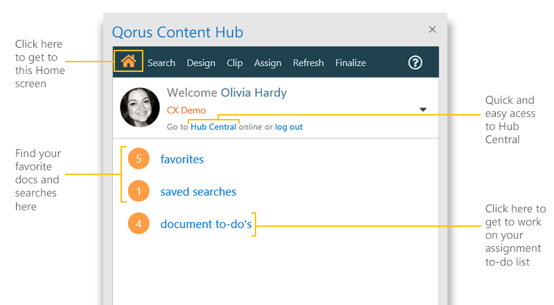
When you log in to any of the Qorus Add-ins, the new Home screen is the first thing you'll see:

|
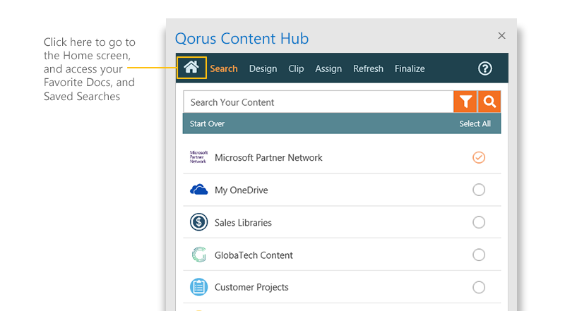
The 'star' icon below the search bar in the 'Search' pane is no more. Since favorite docs and saved searches have moved over to the new 'Home' screen, click on the 'Home' icon in the top nav to access them:
|
The Manage screen has been retired
Since we've moved everything that was on the 'Manage' pane to the new 'Home' screen, the 'Manage' screen is no longer needed, and has been retired as part of this release.
You can now from the new 'Home' screen, more easily get to Hub Central, log out, and even switch to another Qorus Hub (by clicking on the orange link below your name), if you belong to more than one.
The new 'Alternative Preview'
Selectable Previews are tricky. From a technical perspective, there's a trade-off between making the layout look really good, and making it easy to select the text you want to re-use from within the body of a document. Plus, there are so many ways to style and format documents, and what seems to work well with some docs, may not work so well with other docs.
That's why we've added an 'Alternative Preview' to the Selectable Preview, that you can now toggle on or off, to get the best preview experience for the content you're working with.
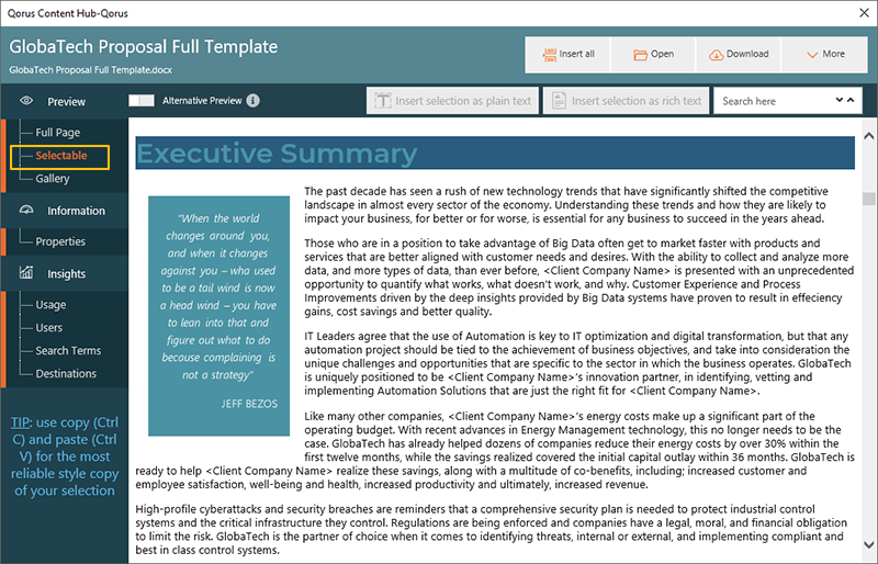
Here's an example of a document previewed using the default Selectable Preview:

The layout and formatting are not exactly right here. The 'Executive Summary' heading should be white, and the blue callout box is further down this page and not directly below the header. The advantage of this preview however is that it is very easy to click and select text within this preview and insert into another document.
Let's have a look at the same document with the 'Alternative Preview' turned on:

Now the heading is white, as it should be, and the layout and styling is much closer to how the actual doc looks. We can even see headers and footers in this preview, unlike the default Selectable Preview. However, selecting text is a little trickier here compared to the default option, especially when moving from one paragraph to another or when working with text boxes in documents.
Ultimately, it all depends on your content, and what works best for you. Now you have a choice, and if you prefer the Alternative Preview and turn it on, we'll remember your choice and we'll keep the Alternative Preview turned on for other documents you preview. You can easily turn this on or off at any time.

Comments
Please sign in to leave a comment.